You can’t live near the Yorkshire Dales and not love a drystone wall, carving up the landscape into pasture-sized segments. But are they better photographed in black and white or colour? They are after all, fairly monochrome themselves, Only you can decide …
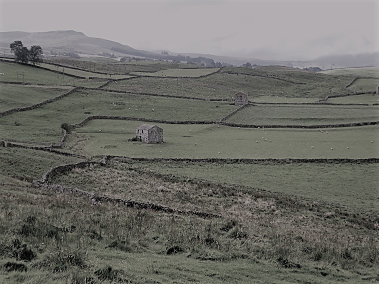

Near Grassington, Wharfedale
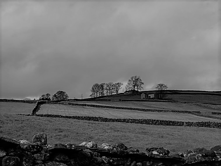
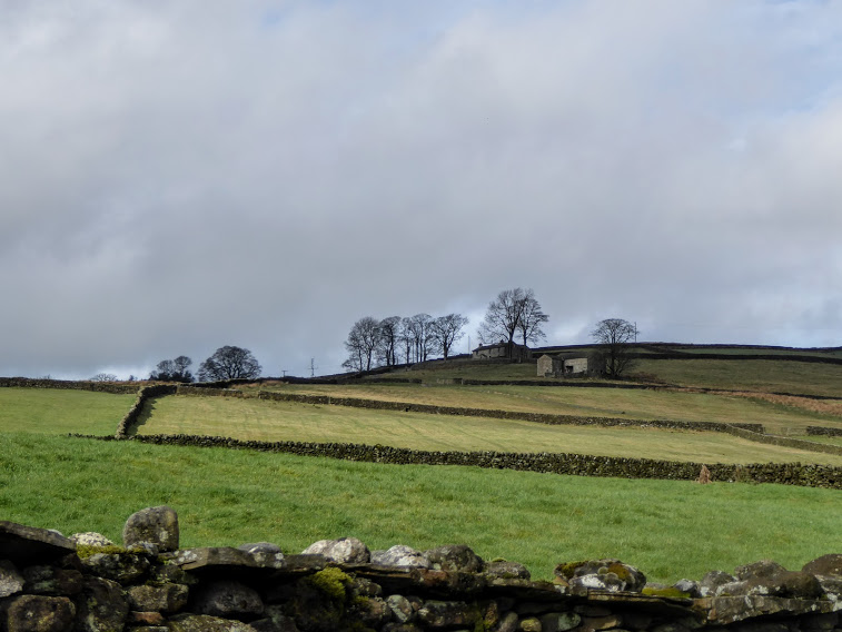
Near Hebden, Wharfedale
Enough of decisions. Here are a couple in good old-fashioned black and white.
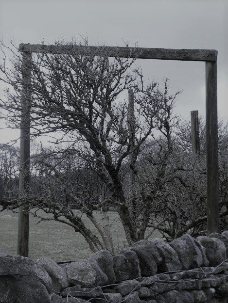
This one’s for Monday Window. It’s not often you see a window above a dry stone wall. And this one’s not quite in the right place. The view could have been better framed. And a bit of double glazing wouldn’t come amiss.
And finally…
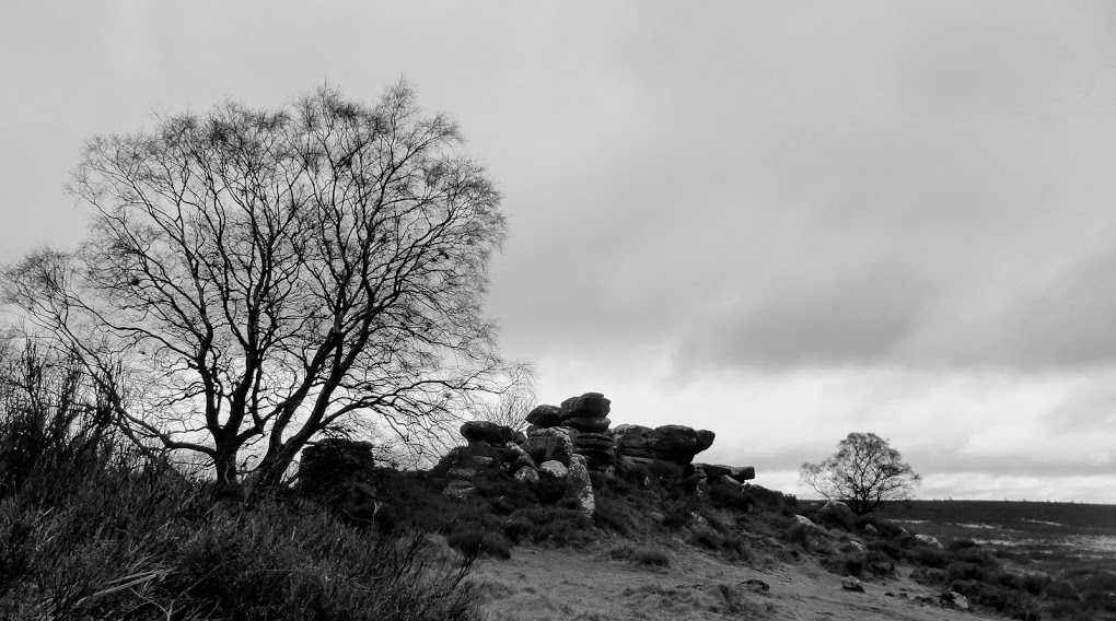
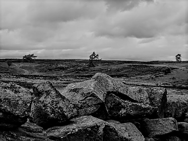
The featured photo shows part of Brimham Rocks, Nidderdale

I think the three last ones are all nice in monochrome, but mostly I prefer colour. I am a colour person…I believe it is the front stones up close that makes me love the last three images. Your last image is my favorite – love everything about it. The lines, the sepia and the vinjette.
LikeLike
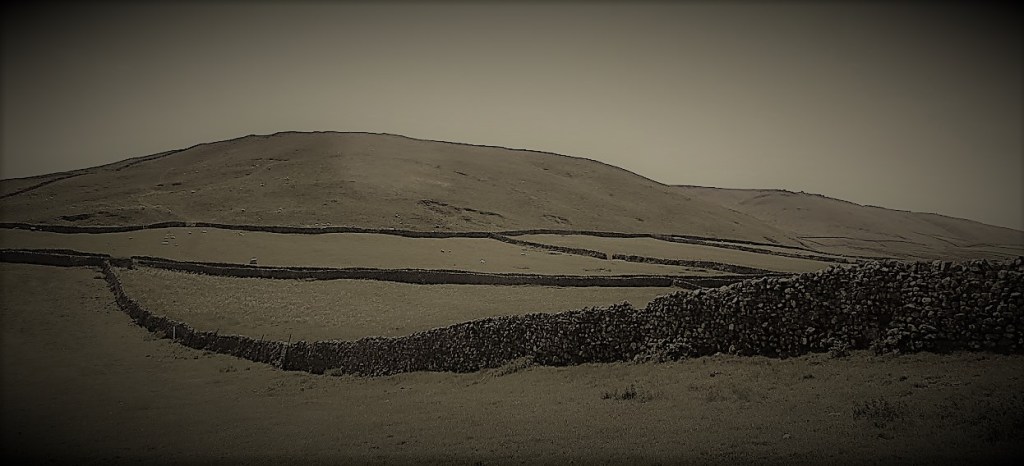
Thanks for that Ann-Christine. When I was choosing the photos for this, I honestly expected the images to stand up well to conversion. But I rejected such a lot as being just – well -dull. My own favourite is the featured image, perhaps because it was already pretty monochromatic as it was a very dull day. That last one has worked fairly well, but I still prefer its green original.
LikeLike
What stunning pics in any colour! Bravo! (Although I must say the textures pop out for me better in black and white…)
LikeLiked by 1 person
I tried to choose those with lots of texture for just that reason – thanks!
LikeLike
I like these, my home county of Derbyshire has the same walls. I remember going to Brimham Rocks in Winter 2001 on a wild windy day.
LikeLiked by 1 person
Once experienced in challenging weather never forgotten! I know Derbyshire reasonably well, having once lived in Sheffield. Love it.
LikeLiked by 1 person
Seeing the same pic in the adjustable format is interesting. For this set, I enjoyed the color more. However, the monochrome set is wonderful. Something about large rocks that shows well in monochrome. Love the texture of the last one.
LikeLiked by 2 people
Thanks Frank. I wasn’t awfully pleased with the monochrome versions, though I think that with a better editing programme I could have done better. Like you, I preferred colour.
LikeLiked by 1 person
🙂
LikeLike
Beautiful photos – I prefer color, but the black and white photos enhance the contrast of the boundary lines created by the rock walls. It must have been quite a back breaking task building those walls so many years ago. AND I especially love the effect of sliding the line between black and white and color. Nice touch.
LikeLiked by 1 person
Dry stone walling is still an appreciated craft skill. You quite often meet people repairing or building them, and only very recently, I saw an advertisement from someone seeking a young apprentice.
LikeLike
Drystone walls are so special, thanks for the pictures both black and white and coloured.
LikeLiked by 1 person
Thanks Susan. Drystone walls aren’t part of the London scene, are they?!
LikeLike
Sadly not.
LikeLike
I am going to go for colour in those slider images, the green just pops! But the Brimham Rocks photo is excellent in black and white. The shades and tones are perfect in that one. The tree is so lovely. I adore winter trees and their structure. And the rocks just stand out so well. I think trying to convert what was a colour photo is where the problem comes with B&W photos. You really need to be imaging the subject without colour. You look for different elements in a frame than with using colour (the frame btw is brilliant) you need to observe textures, patterns, contrasts etc. And you mentioned that a lot of your photos looked dull when converted. This is where upping the colours help – as I mentioned in my post. Making the sky more dramatic, lightening or darkening the shadows. It’s all a very different way of looking at a scene.
I think I have fallen in love with black and white this month and may be setting myself more challenges in the future and I simply must set the camera onto mono settings and head up ‘my’ hill.
Thank you as always for a lovely post.
Jude xx
LikeLiked by 1 person
Thanks Jude. I, in contrast, have fallen out of love with b/w. I think because of what you said in your comments, which make a lot of sense. I think I’ll make b/w my starting point, instead of, as here, making it an add-on. Or else getting hold of more sophisticated editing programmes. As ever, you’re making me think. Thanks! xx
LikeLiked by 1 person
Your Brimham rocks scene is my favourite of the monochrome. As you say, the others are just, well, dull. Jude gives you an idea in her comment as to what you should be looking at in the frame, and I agree – textures, patterns, contrasts…. Getting the tones and the contrast right is a lot of what it’s about
LikeLiked by 1 person
Yes, Sue, it was an experiment that didn’t really work. But I’d taken it too far to abandon it. And the tools I have to play with are limited, but I might do something about that.
LikeLiked by 1 person
Ah, we shall see!
LikeLike
What a lovely selection no matter what format you’ve used. I’m sure I’ve stood in that spot near Grassington with the lone barn (yes, I know there are two!), although it is a scene you can find in many areas.
LikeLiked by 1 person
Yes, there are … one or two… In fact I wouldn’t swear to exactly where that scene is. But it shrieks ‘Yorkshire’, doesn’t it?
LikeLiked by 1 person
I also love a drystone wall. They’re such a contrast to the dark dressed and mortared stone walls in the city where I grew up. I prefer the colour photos because the black and white lose the subtleties of the green. I have some lovely monochrome photos of walls in the Dales but they were taken in colour with snow on the ground.
LikeLiked by 1 person
Oh, that sounds nice. I prophesy there’ll be little enough now this year though. Yes, I don’t think b/w works too well for the walls. They need the green fields!
LikeLike
These are beautiful photos, Margaret. I like the first two in color version. I also like the texture of the black of white of the last three.
LikeLiked by 1 person
I think I have some way to go before I feel comfortable with b/w. I’m going to try to take my originals in that way for a while and see if that improves things. Gotta keep learning!
LikeLiked by 1 person
💖💗
LikeLiked by 1 person
Drystone walls always make me think of skill and patience and an enduring quality. I think they make a good subject for black and white photography, especially captured against a bright, low cloud as in the top picture.
LikeLiked by 1 person
Yes – that s the only real success story I think. But I’ll keep trying. It’s fascinating watching wallers at work – and we do it surprisingly often. Such skill.
LikeLiked by 1 person
Thank you for that unique and plain window. I love your walled landscapes. Not something you see this-side of the pond. To me the color versions are more likable.
LikeLiked by 1 person
Yup. Join the club!
LikeLiked by 1 person
The Header’s lovely too. In that first you’ve used a ‘green-toned’ black and white? and I rather like the faded look. In the second I prefer the black and white and the last lends itself to the drama of that sepia/brown. I’m kwite into playing with the shades if I have time. It’s just good to give something a different look. 🙂 🙂 As you have ably demonstrated.
LikeLiked by 1 person
Thanks Jo. I think my editing tools are fairly crude really. Maybe time to move onto the next level?
LikeLike
🤔💕💕
LikeLiked by 1 person
Colour for me! I LOVE the myriad of greens and the weathered browns of those separations. Loved them im Devon, love them everywhere.
LikeLiked by 1 person
Join the club! Yes, it’s the greens that make the landscape, isn’t it?
LikeLiked by 1 person
Love the experimentation, learn so much from it. And like Jude and Sue I love the Brimham Rocks, but the rest are great too. Yorkshire landscape always looks fabulous in my eyes
LikeLiked by 1 person
Good old Yorkshire! But yes, photo challenges keep me on my toes, because I’m in no way a photographer, and it’s good to have Jude and co. stretching my skills.
LikeLike
They’re all stunning in their own ways and I’m going to sit on the fence on this – or more appropriately on the wall! That said, I absolutely love the header image in b & w.
LikeLiked by 1 person
Thanks Sandra. That one seems to have the popular vote – and from me too.
LikeLiked by 1 person
I love the green for the grass, but the trees are wonderful in black and white. Thanks for introducing me to the shutter mode where you can post color and black/white. That’s really cool!
LikeLiked by 1 person
It’s fun, isn’t it? But you don’t need these gizmos so much on your blog, maybe?
LikeLiked by 1 person
Very fun. I’d like to try them out on a Saturday photo post. I’ve been playing with the camera taking color and black and white shots.
LikeLiked by 1 person
Oooh. Share it with us all soon!
LikeLiked by 1 person
Our child is on holiday this Friday, but if I get a few good photos in on a walk, I will. : )
LikeLike
Those walls are amazing.. the effort was huge.. 😉
LikeLike
It’s a really skilled job and fascinating to watch someone at work.
LikeLike
I’m very partial to a dry stone wall too. The first b&w picture intrigues me. The grass looks as if you can see through to the green ‘below’.
LikeLiked by 1 person
Gosh. I’m not sure if I’m seeing what you’re seeing – intriguing.
LikeLiked by 1 person
I hardly know if I am imagining the green. It is just a hint.
LikeLiked by 1 person
Very interesting to compare, and thinking in black and white does make one try to ‘see’ differently. On balance I think I prefer colour, but it is good to experiment. Those walls really are incredible.
LikeLiked by 1 person
They really are. Yesterday we saw some that the passage of time had caused to undulate wildly – but they were still standing.
LikeLiked by 1 person
It is amazing how robust they are through all sorts of conditions.
LikeLiked by 1 person
They really are fantastic creations.
LikeLiked by 1 person
Monochrome certainly gives the better atmospheric feel.
LikeLiked by 1 person
But makes you think Yorkshire days are always grey!
LikeLiked by 1 person