Even though over the last few days the weather has reverted to winter chill with a vengeance, I think it’s definitely the week that Spring has Sprung. The daffodils have suddenly burst forth into golden glory. The grass is lusher. Dandelion and daisies crowd the verges. Spring announces itself in an explosion of colour, in contast to the muted browns and greys of winter with its dull skies and overabundance of mud.
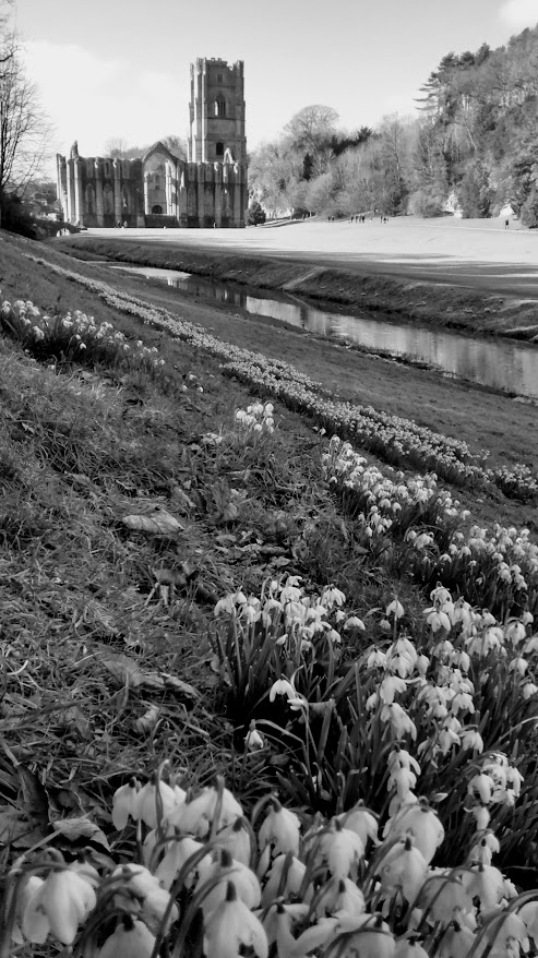
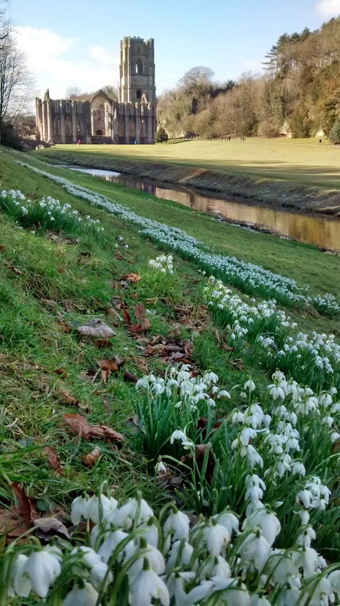
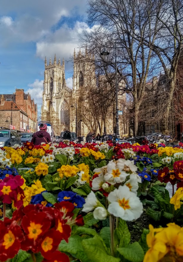
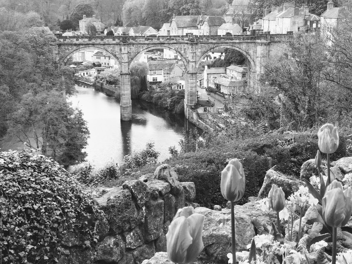
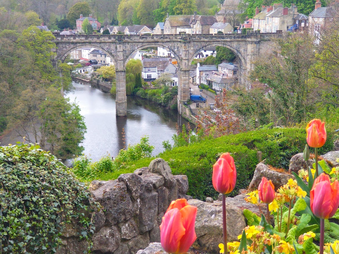
So is there even any point in ‘doing’ spring in monochrome? I thought I’d find out, and chose four images where it’s not just spring flowers telling the story, because they’re complementing the buildings they grow near.
Part of my own difficulty is that I don’t enjoy tinkering with photos. What comes out of the camera either works, or it doesn’t, and then I’ll junk it. At most I’ll level the picture up, maybe lightly crop it, even – slightly – fiddle with brightness. So my translations into monochrome are crude at best. If I want monochrome – and I’m increasingly choosing it over colour – I’ll shoot in black and white. And perhaps follow up with a further version in colour. I admire those photographers who use editing tools with discretion, so what we see is the original shot – just enhanced in subtle ways. I’m less keen on dramatic editing. But in a diary that is already over-full, I guess I don’t feel like giving this particular skill the time it needs to learn to do it well.
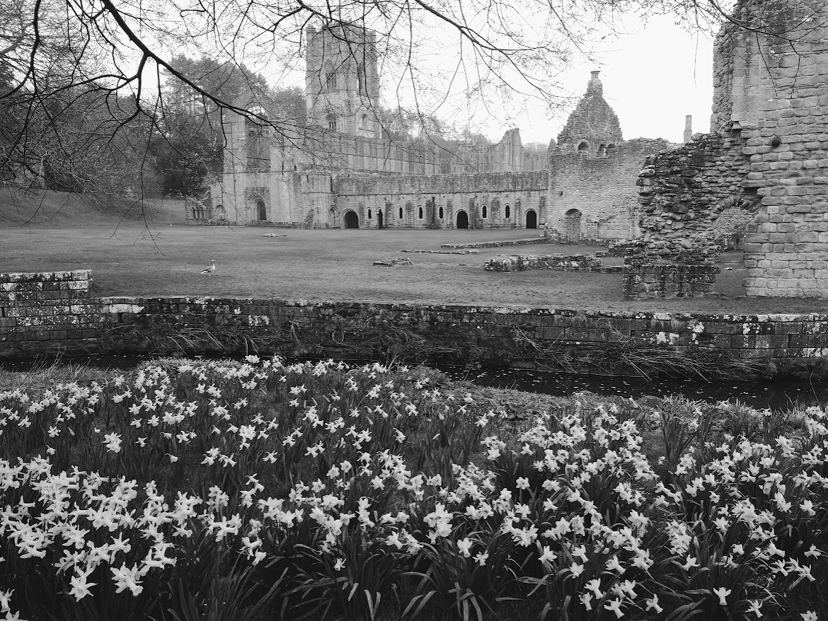
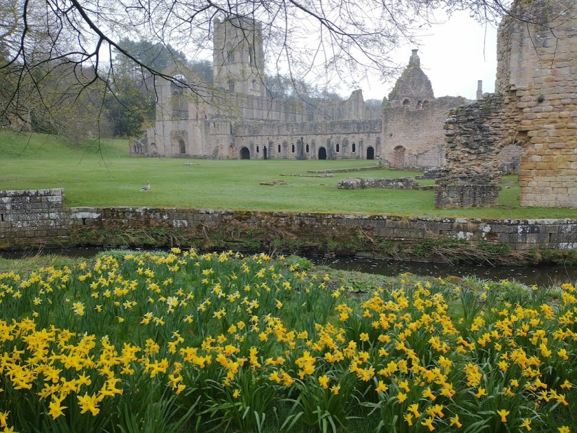
I’ll finish with Fountains Abbey as it is now, its grounds carpeted in daffodils. Black and white as my featured photo, and – my much preferred version here – in the above-mentioned Glorious Technicolor.
For Leanne’s Monochrome Madness

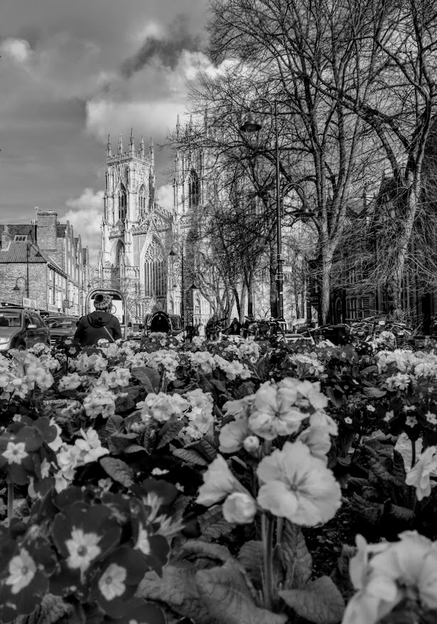
I like seeing the two versions, monochrome and colour, of the same image. Somehow I can’t pick a favourite. Both versions highlight different things. It’s quite surprising. Even the one I though I should prefer in full colour (York Minster with the bright primroses) – the black and white one has something I really, really like. Hm. Interesting pictures, as per usual, Margaret!
LikeLiked by 2 people
Ah, thanks Britta. I agree about the York MInster image. But if I could handle this editing malarkey, who knows what masterpieces I might turn out!
LikeLiked by 1 person
I agree with that. There is a directness with the B/W that is appealing but those flowers sure are colourful!
LikeLiked by 1 person
You all make good points. And it’s good that we all appreciate slightly different things.
LikeLiked by 1 person
I think your first mono of Fountains works well, but after that I lose interest because the colours need to be vibrant and tell their story. And don’t they do it well? I’m no photographer, Margaret, nor really interested in the process. I just like beautiful photos xx
LikeLiked by 1 person
You were rthe person for whom colour photography was invented, Jo, and you celebrate vibrant colour so well. I tend to agree with you in with this particular set of photos, but I’m a big monochrome fan too.
LikeLiked by 1 person
These all work well. I was looking through thinking ‘I want to go there,’ especially that viaduct 🙂
LikeLike
Oh, the viaduct over the Nidd is glorious. Yet I can imagine the fuss there must have been when it was proposed. I’d probably have been out there with my banner, protesting!
LikeLike
I think I need to see daffs in all their glory but primulas are better muted. However, that says more about my taste in flowers than photogrpahy.
LikeLiked by 2 people
Nope, I agree completely.
LikeLiked by 1 person
My goodness these images are incredible!
LikeLiked by 1 person
Oh thanks so much Dawn.
LikeLiked by 1 person
My thoughts exactly on the editing!
LikeLiked by 1 person
👍Hooray! We’re an exclusive band, I think.
LikeLike
Margaret, I am with you, I am unsure of what to do to edit photos other than add a watermark or crop a photo. I prefer color to black and white. But black and white is best for winter and it is now spring. Use color and show how the earth is being reborn and colonized after the long winter which is more suitable for black and white. I love the preview of what is to come. I was in the backyard yesterday evening and I noticed daffodils pushing their way to the daylight. A glimpse of what is to come. Stay well and live life in technicolor.
LikeLiked by 1 person
Glorious technicolor even! Thanks for your observations, Clay. It seems your spring is a little later than ours. But it’ll soon come rushing along. And needing colour to record it at its cheerful best.
LikeLiked by 1 person
Lovely photos
LikeLiked by 1 person
Thanks Sheree.
LikeLiked by 1 person
Spring for me is all about colour after a usually dull and grey winter. I am surprised therefore to like the York Minster image better in monochrome than colour. Possibly because I find all those primula colours far too brash. Daffodils must be in colour! But the problem with the Fountain’s Abbey photo I think is that the building itself is too grey. Not enough contrast. Same applies in the colour version. Tulips also must be in colour unless a macro or close-up shot preferably of one in decay – but as always these are my personal opinions. I am always happy to see your photos (and increasingly your black and whites) whatever the format.
LikeLiked by 1 person
Thanks for that Jude. I agree with your comments about both Fountains Abbey and York. Funnily enough, although I wouldn’t have wanted those primulas in my garden, in the context of a civic display, I found them OK. I didn’t really expect this experiment to work, and it didn’t – but maybe it had to be done – once only. Thanks so much for your accolade!
LikeLike
I disagree. I think your experiment did work. It made us consider the images carefully. I found it interesting to see which ones worked in monochrome and which didn’t.
LikeLiked by 1 person
Oh, thanks. That had been the idea, but I felt the result was clearly that spring was best left severely alone by the monochrome photographer!
LikeLike
As you know I like monochrome a lot but only when it suits the image and subject matter, and I confess I prefer most of these in colour. The exception is the Fountains Abbey shot which I think works equally well in both 🙂
LikeLiked by 1 person
Inteesting. I wasn’t wild about the Fountains shot, and yes, this is an experiment I shan’t repeat. By the way, it was you I was specifically thinking of when I said I admired those photographers who use editing tools with discretion. I like to kid myself those photos haven’t been edited at all, but emerged just as we see them, straight from the camera, and you always score highly!
LikeLiked by 1 person
And yet almost all my photos have been edited just a tad and many of them quite a bit! But apart from an occasionally arty moment I do like to keep them looking fairly natural and representative of the scene as I saw it 🙂
LikeLiked by 1 person
I know you edit most of your shots: you’ve made no secret of it. But the impression they give is that I believe absolutely it’s just what you saw. Resut!
LikeLiked by 1 person
😊😘
LikeLiked by 1 person
I think architecture suits monochrome more than colour but really it’s each to their own!
LikeLiked by 1 person
Indeed. Yes, this was an experiment in which the architecture won hands down I think.
LikeLiked by 1 person
Lovely photos in colour and monochrome. York is my favourite city in the UK and love it in all seasons. I have a painting of that very scene in Knaresborough.
LikeLiked by 1 person
Brilliant! If you have the picture, I assume you have visited, probably more than once?
LikeLiked by 1 person
My husband was born in York and emigrated to Canada as a young man. We flew over to York 48 years ago so I could meet the family and to get married. We have been a number of times since. I bought the painting from an antique shop in Knaresborough.
LikeLiked by 1 person
Great! You must be quite well travelled within England – the north at least.
LikeLiked by 1 person
You have brought out some important points about photography, Margaret. How much editing should be done? I believe that it’s the imperfections that often make our memories more relatable and meaningful. I love your photo post!!
LikeLike
Thanks for tha Rebecca. I’m all in favour of a point of view that suggests that perfection is unnecessary!
LikeLiked by 1 person
The primulas are just too confusing to the eye in colour. Other than that, I prefer the colour versions.
LikeLiked by 1 person
That sounds like the poular vote! This is easier than national elections, isn’t it?
LikeLiked by 1 person
In the three pairs you showed, it’s interesting to see how color affects my perception. The color images lead my eyes to concentrate on the flowers. The monochromes lead me to the structures. Excellent post!
LikeLiked by 1 person
Thanks for giving it your full attention, Egidio!
LikeLiked by 1 person
Colour is the go, bring it on in all its joy.
LikeLike
Quite right too! We Brits need it after a l-o-n-g winter.
LikeLiked by 1 person
And we’ve had a long summer. Maybe it’s just the politics making everything tiresome 😉
LikeLiked by 1 person
Tiresome is an understatement 🥺
LikeLiked by 1 person
Beautiful Margaret.
LikeLiked by 1 person
Thanks, Cindy.
LikeLike
A very interesting post Margaret. I find I prefer B&W in some of the images, color in others, all lovely. I agree on your opening image – the color version is wonderful. On the other hand I prefer the primulas image in B&W. You know what they say, different strokes for different folks? I suppose that applies to images too! Wonderful post!
LikeLiked by 1 person
Thanks so much. It’s got people talking, which is always good!
LikeLike
Oh my! Think you are inspiring me to a monochrome post as the skies here continue to be grey! 5 days too without wifi waiting for an antenna repair due to strong winds! So have missed many posts.
LikeLiked by 1 person
Oh dear. It sounds as if your current posts will be monochrome whatever you do.
LikeLiked by 1 person
I almost have it ready!! Indeed misty and mysterious too.
LikeLiked by 1 person
🤣
LikeLiked by 1 person
It’s interesting seeing both, though I think you notice different things in each. For me the monochrome versions are more about the buildings and looking at them, where as the colour ones are more about the flowers and foliage.
LikeLiked by 1 person
Fair point. So for the latter, I’ll (generally) stick with colour I think.
LikeLike
Spring is gorgeous in any case. Any photo with red, I need color. The snowdrops looked beautiful in black and white.
LikeLiked by 1 person
Thanks Rebecca. I think it was the most successful b/w one.
LikeLiked by 1 person