This week, Patti has invited us to explore colour photography, as against black and white for her Lens-Artists Challenge. She’d like us to present the same image both in colour and in monochrome. Because I do very little post-processing, I’ve used the fairly limited options offered by Google Photos.
What to choose? I decided to pick images that I thought were sure to work best in colour, and see what happened if I imposed a monochrome palette on them. I was quite surprised.
First of all I looked at my images of Vitré, the charming French commune I shared with you a couple of weeks ago. Surely it’s all about the colour of the gaily painted houses there?
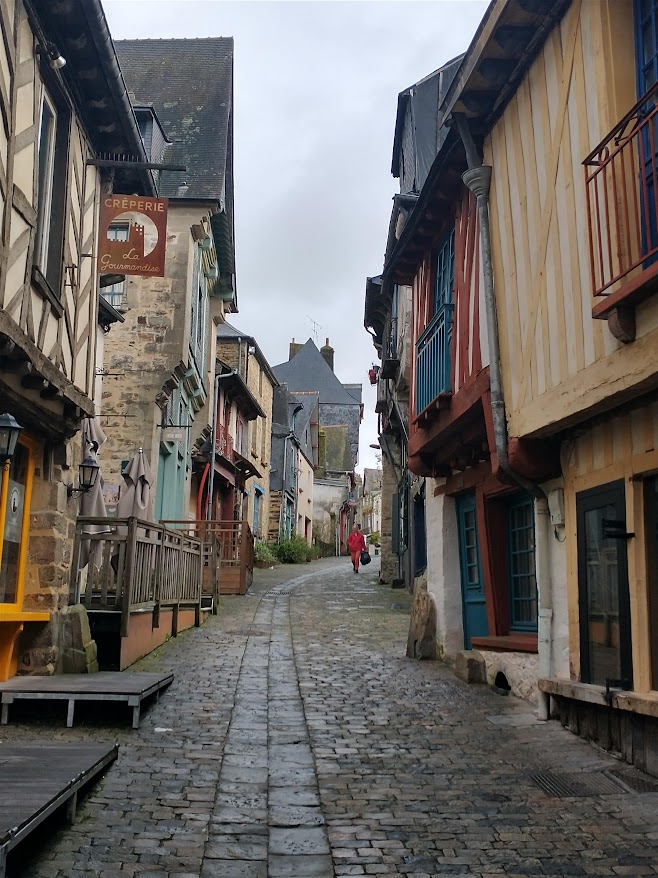
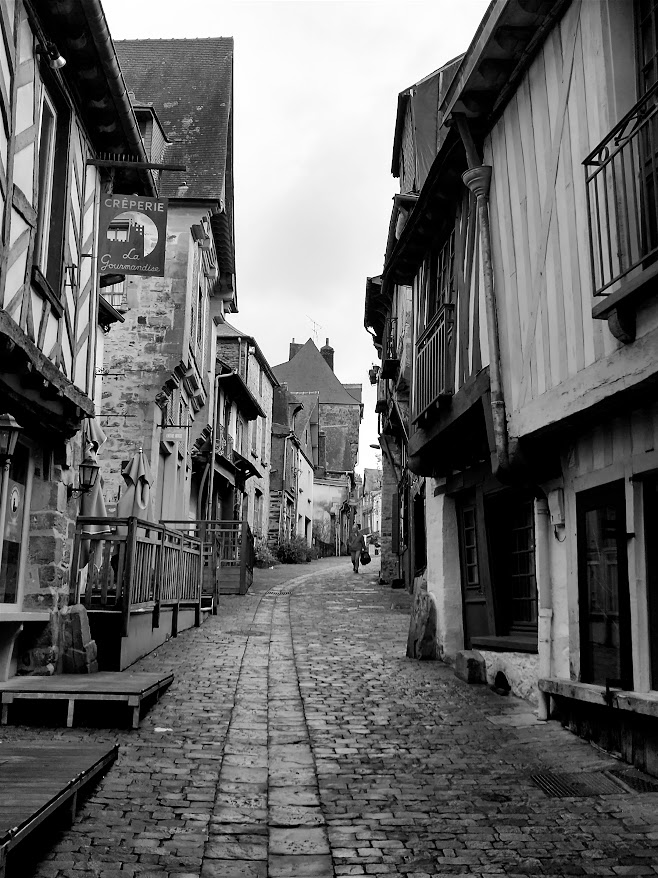
I surprised myself. I liked both – perhaps because there’s a bit of an expectation that half-timbered houses, in England at least, tend to be in black and white. What gives the coloured image the edge in my eyes though, is the lucky chance of that figure in bright red strolling down the street. It just lends an extra focus to the shot lacking in the monochrome image.
Then I went to familiar stamping grounds. Brimham Rocks.
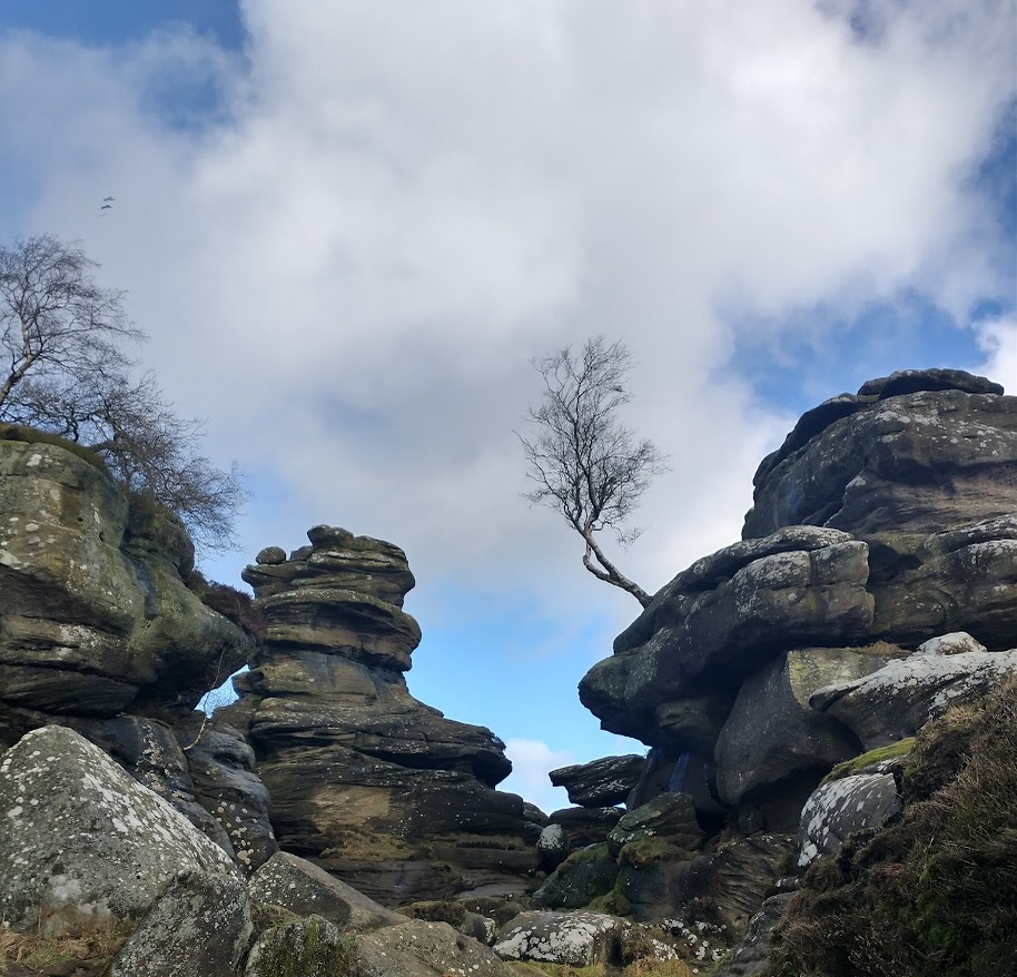
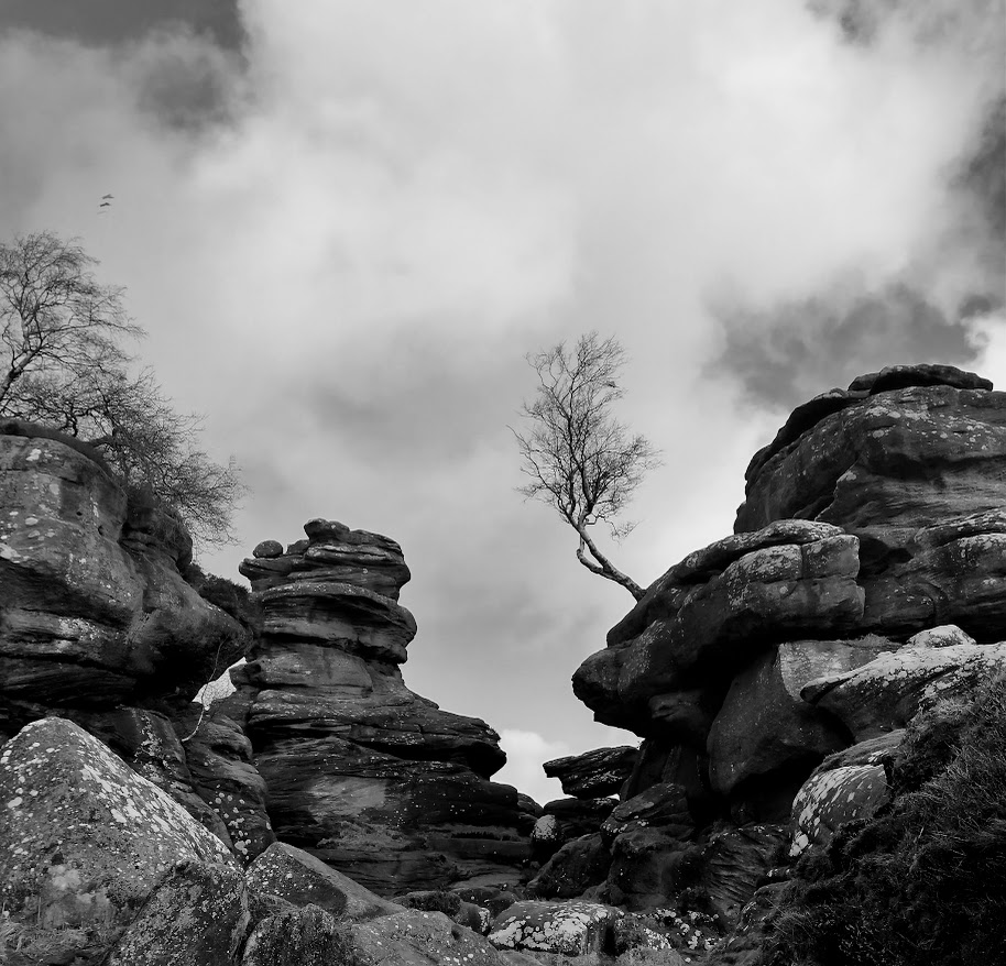
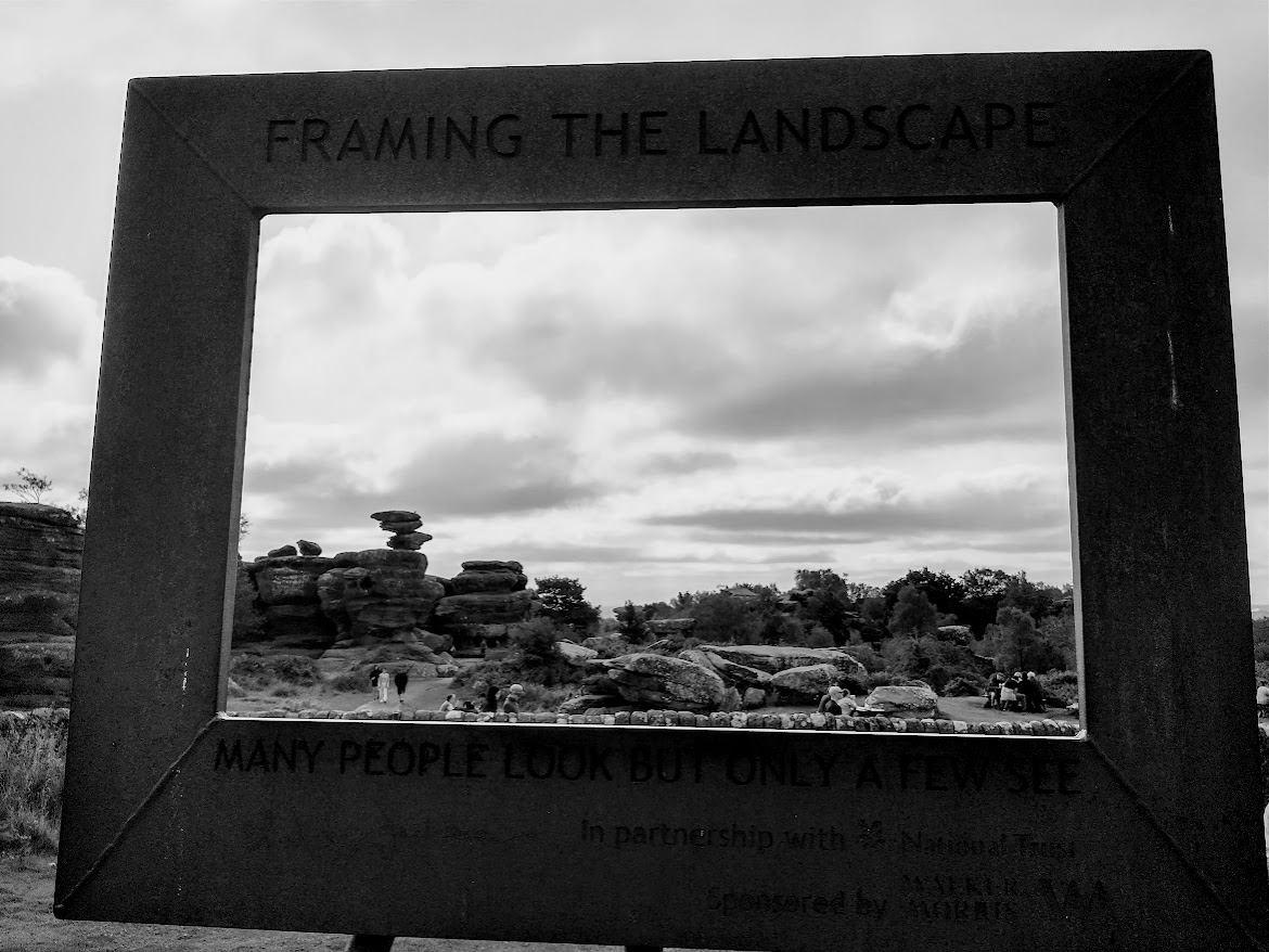
I’m pretty happy with both. Those puffy cumulus clouds help to lighten the sky in the black and white image. It might otherwise have been a little uniformly grey. I’ve just popped another image in as the header photo. The rocks as seen through a conveniently sited picture frame. Trust me. The colour image is barely any different. It was a very overcast day.
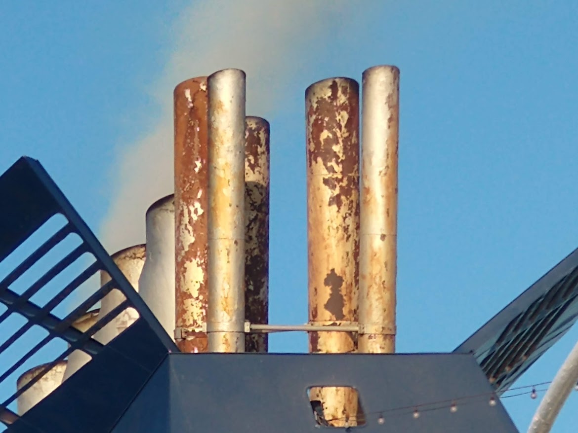
The last image is of the simply appalling ferry we took from Rome to Barcelona the other year. Those rusting chimneys have their visual appeal, but the rest of the ship was like that too! Would they work in black and white? Let’s see.
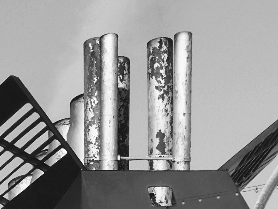
Hmm. I think it’s OK. The rusty pipes have sufficient contrast to work even without colour. In my opinion.
So there we have it. Are you a fan of colour, monochrome, or both? And do you have any strong feelings about what works, or doesn’t, here?
I decided to include this post in Leanne’s Monochrome Madness challenge. She can close her eyes to the colour versions.

Sorry, hon, but it’s colour all the way. The wonderful textures of Brixham Rocks are lost in black and white. It’s a great shot, by the way. Agree with you entirely on the first. The last, well I’m a bit indifferent, but I consider myself warned xx
LikeLiked by 2 people
Quite. Grimaldi Lines. If only we’d read all the negative comments first! Me and photos though? I’m turning into a monochome fan!
LikeLiked by 1 person
I think I’m turning into a monochrome fan, too, Margaret. Love the black and white ones. Not that the colour photographs are bad, on the contrary, but that last image in particular, the pipes, really looks so much more interesting in monochrome.
LikeLiked by 1 person
Ah thanks Britta. I tebd to agree. Better would have been no opportunity to take that photo!
LikeLiked by 1 person
It’s always interesting to make these comparisons. I totally agree about the first image. That red coat is key. Considering the rocks, my immediate reaction is towards the colour version. But looking again, it’s the brooding atmosphere I see in the b & w which draws me in. The rusty chimneys seem more interesting in b & w. Makes me wonder what lays behind the image, although from the sounds of it, I’m better off not seeing any more of that ship!
LikeLiked by 1 person
No. Avoid That Ship. And thanks for your considerd comments. When are we going to visit Brimham – or anywhere ekse in Yorkshire – together?
LikeLike
ooh you have been having fun – I am glad you have shown both. I am a bit of fan of clouds and landscapes in B&W, and the first one gives the feel we have stepped back in time. Wonderful
LikeLiked by 1 person
That’s a good coment about the first one, and quite right too. Thanks!
LikeLiked by 1 person
Great choices for the challenge!
It’s a matter of preference, I found. The ship I liked the colour, the rocks the monochrome. I like both versions of the street scene – the coloured is “gaily” while the monochrome is “gritty” – so it’s a toss-up!
LikeLiked by 1 person
Ah thanks. Yes, those were rather my feelings. Today. Ask me tomorrow and it’ll be different again.
LikeLiked by 1 person
Well I totally disagree with Jo. Black and white works for all three. In fact I prefer it. The red coat figure gets lost among both images, but the timber frame shows up more in the mono version.
LikeLiked by 1 person
Well, I’m glad you disagree with Jo. So do I rather. Good to disagree over these kinds of thing. Pistols at dawn unnecessary!
LikeLiked by 1 person
First and last in colour for me, but black and white for Brimham Rocks which look very atmospheric in monochrome.
LikeLiked by 1 person
Ah thanks. Well, BR are indeed very monochrome. If shades of brown in real life
LikeLiked by 1 person
Lots of lichen?
LikeLike
Not so much. They’re so well clambered over.
LikeLiked by 1 person
I like the photo of the ferry, but travelling on it can’t have been soothing
LikeLiked by 1 person
Nightmare. Best forgotten.
LikeLiked by 1 person
Always colored. I love seeing different colors. The images are more beautiful with it.
LikeLiked by 1 person
Ah thanks! I think it must be my age. Brought up with only b/w illustrations in books, they’re my default setting!
LikeLiked by 1 person
Different people, different likes, I agree. It’s okay. People have different upbringing and born I’m different generations. It’s so understandable. I even use dark themes of my phone as a way to protect my eyes from brightness.
LikeLiked by 1 person
In*
LikeLiked by 1 person
Ah! Now that’s taking practicality to a whole new level!
LikeLiked by 1 person
An interesting threesome! I’m in two minds about the first one. Were it not for the figure in red I would say definitely B&W, and if you’d only shared that version we’d never have missed that pop of red because she (he?) could have been wearing dull brown/grey etc! So I’m leaning towards B&W there but think you could make an argument for colour. The Brimham Rocks shot I definitely prefer the B&W edit although there’s nothing wrong with the colour one. And for the ferry, I’m so drawn to rust in photos that I rather like the colour but the B&W also works, for different reasons. That one emphasises the shapes, including the structures either side, whereas the colour one brings out the rustiness. I think a colour shot cropped to just show the chimneys could be very effective, but with this wider shot I again lean towards B&W if I must choose!
LikeLiked by 1 person
Oh thanks for such a considered reply, Sarah. I don’t know why I never thought of cropping the rusty chimneys. Definitely a good plan. I have the feeling that you, like me, are doing a good deal of leaning towards B/W these days – in other people’s photos if not our own!
LikeLiked by 1 person
I wouldn’t say I’m leaning any more than in the past, as I’ve always favoured B&W for some subjects e.g. street photography, modern architecture, portraits. But I’m doing more of it myself, mainly because of blogging challenges!
LikeLiked by 1 person
These challenges eh? Always making us try harder!
LikeLiked by 1 person
Here’s my opinion, for what it’s worth…
The first image I love the soft colors, and you lose the person without the red coat being red. So that one I like better in color.
The second image, with the tree, I think the starkness of the landscape is better without the distraction of the blue sky and clouds, so I like that one in black and white, though I went back and forth on that one. I could go either way.
The third one, the ferry image, is EXACTLY the kind of image I like in black and white. Clean lines, simple shapes. That one is stunning in black and white.
LikeLiked by 1 person
Thanks for such a considered reply Dawn. I agree with all your reasoning, though I flick back and forth between which ones I prefer myself.
LikeLike
You picked well. And surprised myself: only the rusty pipes I prefer in colour. I really liked the monochrome versions of the first two photos. They are stripped off superfluous, distracting elements with the colour gone.
LikeLiked by 2 people
It’s funny, I change my mind according to my mood. So I’m tending to agree with mot of the comments, even when they contradicyt one another. You all give such good reasons!
LikeLiked by 1 person
Really lovely photos. I like both versions of each, although the Grimaldi ferry seems to warrant the forlorn look of rust in black and white!
LikeLiked by 2 people
Forlorn is the word you need, Rebecca!
LikeLiked by 2 people
Great examples, Margaret. Although I find all images very appealing, whether in color or black and white, I noticed I had some favorites in each pair. I like the Old Town in color for the additional charm the colors bring to the town. For the Brimham Rocks, I prefer the black and white. It makes the rocks stand out stronger. As for the last pair, it’s a toss for me, but I a bit more inclined to go with the color version because of the beauty in seeing rust.
LikeLiked by 1 person
I feel black and white brings a certain atmosphere and mood to the picture, which I quite like. Although it is a bit of a shame to rob the beautiful nature photo of its natural colours.
LikeLiked by 2 people
I know! Always a cnudrum, eh? Thanks for your thoughts.
LikeLiked by 1 person
Brimham Rocks look quite jolly in colour, but very brooding in b&w so it definitely changes the character. On this one I prefer the latter; on the others i don’t feel so strongly. Both have advantages.
LikeLiked by 2 people
It’s interesting, isn’t it, how different the ‘feel’ is between colour and b/w?
LikeLiked by 1 person
I think it depends on the message you want to convey – I like the joy that comes through in the colored streetscape, it feels like someone I would like to go – but the black and white of the next two causes me to focus on form and detail but could slide into feeling a bit glum… it’s pretty incredible how quickly you can change the mood with your choice! Linda 🙂
LikeLiked by 1 person
It is extraordinary how different the ‘feel’ is between monochrome and colour, isn’t it? Thaks for your thoughtful comment.
LikeLiked by 1 person
My absolute pleasure – thanks for getting my curious! ❤️
LikeLiked by 1 person
😊
LikeLiked by 1 person
So here are my two cents worth. I like the first and third in colour. I like what the colour contributes to the story and I think in monochrome a lot of that is lost, however, in the second I like the monochrome. The reason being that in colour there is too much focus on the blue in the sky, which is almost the only bright colour. So when you convert it then you see more of the subjects and don’t notice the sky as much. I hope that makes sense.
They are all great images Margaret, very different to one another.
LikeLiked by 1 person
That’s a really great analysis Leanne. You seem to be on the same page as a lot of commenters, but it’s interesting reading all the different views.
LikeLike
Well done, Margaret! It’s nice to see the comparisons. I sure like some of the color images here, especially the first one. 🙂
LikeLiked by 1 person
Ah, thaks Amy. Being cold makes you appreciate colour I think!
LikeLiked by 1 person
It does! 🙂 🙂
LikeLiked by 1 person
Dear Margaret, I love Black and White photography but in here, I am thinking same with dear Johanna. The colour ones more impressive. Thank you, Love, nia
LikeLiked by 1 person
Good to have your thoughts Nia. Colour is definitely your thing!
LikeLiked by 1 person
I always appreciate the smiles you give me, Margaret. That ferry nightmare…ah yes, we have been on an Italian ferry like that! As for your images…a love your header. And the frame! As for the Old Town, they both work for me. Interesting spot of red–as you noticed. For the rocks and the ferry….b&w. The details really shine.
LikeLiked by 1 person
Thank you. I bet you were on Grimaldi Lines too. There can’t be TWO Italian companies running such dreadful vessels.
LikeLiked by 1 person
I think they all work well in black and white. In fact, the ship looks safer – it looks like jazzy patterns rather than rust and decay 🙂
You ought to try flicking your camera to black and white for a day and see what comes out. It makes you see things differently. I think you’d enjoy it
LikeLiked by 1 person
Thanks Debbie. I aleady do that quite a lot, particularly for street scenes. And then flick back to colour often in case I prefer that!
LikeLike
that’s good to hear, Margaret.
I don’t know what your camera is but sometimes you can do both at the same time! I sometimes shoot in b&w but have a colour version saved too. Nothing like keeping your options open 😀😀
LikeLiked by 1 person
That sounds a high class option unavailable to me. Sounds perfect!
LikeLike
I like both. For some reason, distinctive features seem to stand out more in the black and white photos.
LikeLiked by 1 person
I think you’re right. Which is why, I guess, it’s successful for some images.
LikeLike
Interesting examples, Margaret! It’s so difficult to choose, because they all work well in both versions. The Old Town looks amazing in both shots, but, more charming in colour. Love the rusty pipes – but maybe from afar…not from the vessel. The rocks I like both versions of…but they are less sinister in colour.
LikeLiked by 1 person
Ah, you find the rocks sinister? You must come and visit then, AnnChristine, They amaze, but in a good way. Thanks for your thoughtful appraisal.
LikeLike
♥ I’d love to come!
LikeLiked by 1 person
You’d be so welcome … any time.
LikeLike
♥
LikeLike
I like the colour photo of the street, so it was surprising to see how well it works in black and white!
LikeLiked by 1 person
My feelings exactly!
LikeLiked by 1 person