I set this week’s challenge for Leanne’s Monochrome Madness. I must be mad (as required for Monochrome Madness …). What I’m asking for are photos of subjects you’d normally choose to shoot in colour exactly because of their vibrant colours. Can you make them as arresting in black and white?
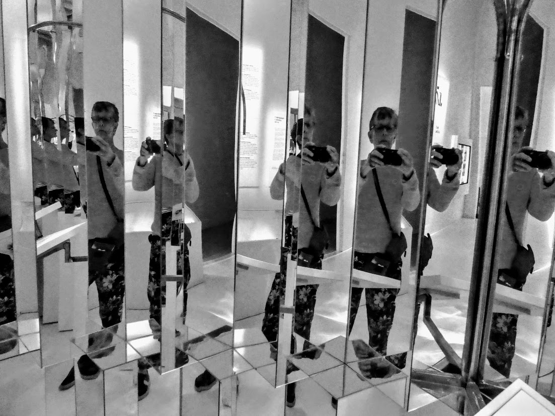
My header photo was taken only about ten days ago in the Nordic Museum in Stockholm. This exhibit was bemusing and distorting us with confusing mirrors and colours. I was suffused in rich blues. As you can’t see here. But does it matter? I was surprised to discover that it didn’t, much.
A couple of months ago, I met Sarah of Travel with Me fame in London, and we amused ourselves with our cameras near the Gasholder development. Some pavement art caught our eye, and our own black shadows contrasted with the rich rainbow tones of the illustrated bottles. As you can’t see here. But it seems to work anyway.

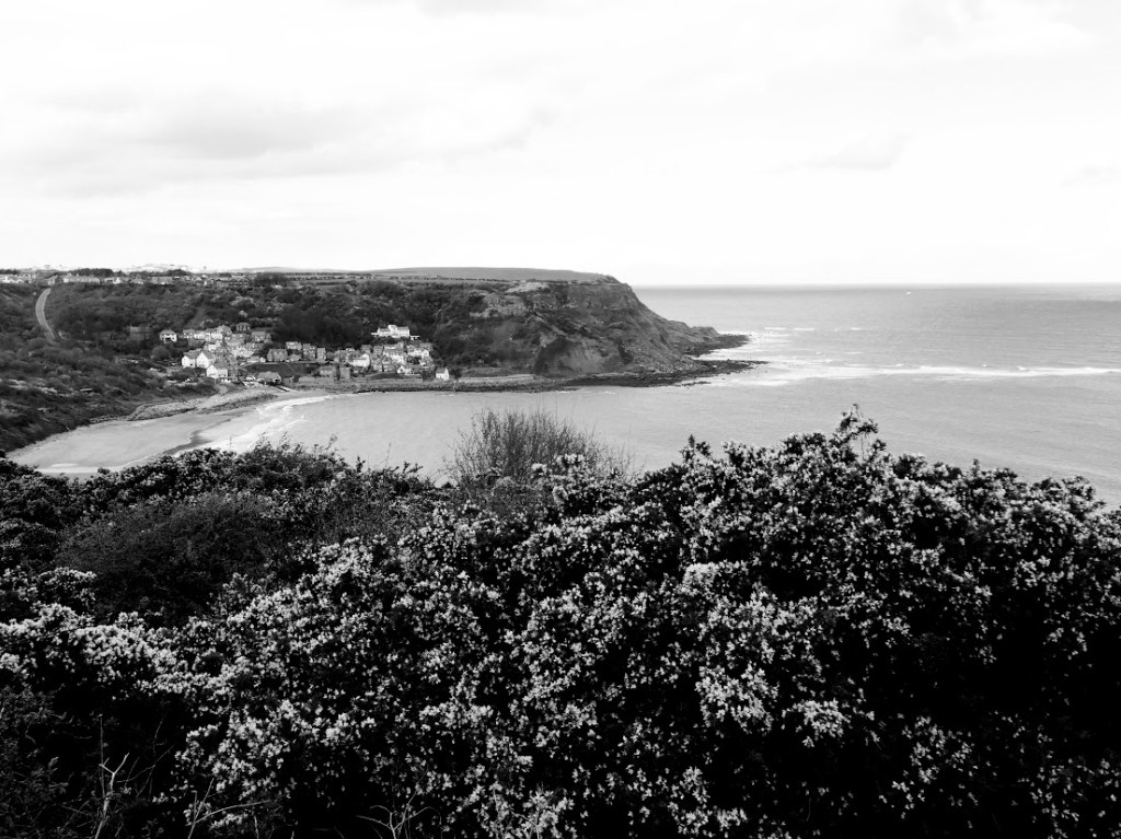
Summer near the sea in England can mean to me clumps of sunshine-yellow gorsebushes on the cliffs near Staithes. Blue sea below, blue(ish) sky above (it IS England after all). So does this work in black and white? Not for me. Another shot might have done, but not this one.
Then there’s the brightly lit-in-multi-colours tunnel near Granary Wharf in Leeds. It’s striking enough in simple black and white, but … in the original,the coloured lights lend a greater vibrancy to the shot.

Let’s go back to Sweden, where we started. When I show my (colour) photos from one of the ferry boats we spent so much time on, ‘Wow! The sea. The sky. They’re so blue!’ is the immediate comment. So what if they’re not …

So what can you come up with? I think three of these images stand up quite well to being in monochrome, one doesn’t, and one just about holds its own. But you can look at the originals below, and make your own mind up. And then please join in! Link your post back to mine, and to Leanne at Monochrome Madness here..
And by the way, you don’t have to include any colour photos you might have used as your starting point. That was an optional extra I imposed on myself.


Weirdly enough I like the last one best, Margaret. Such a nice black and white twinkle on the sea. And the messing about, with tripod? Sarah’s presumably. What’s the closing date on MM? xx
LikeLiked by 1 person
I can’t remember what that tripod-looking thingy is, but neither of us had one. Do join in Jo – any time over the next 7 days would be fine. And I see what you men about that last one. Thanks Jo! x
LikeLiked by 1 person
Great black and white versions of the photos. I think all of them work but the gorse bush as you mentioned. Even so, the curve of the land near the sea is interesting in that one. The colored lights look good in black and white too.
LikeLiked by 1 person
Thanks Rebecca. You’re right about the gorse bush one. Can’t win ’em all!
LikeLike
Great photos, and it can be hard to covey the bright colors in bnw but you did . I like the tunnel best
LikeLiked by 1 person
Interesting. That one was an ‘also ran’ for me. But for me, photos also come with the memories that go with them.
LikeLike
I quite like the Staithes photo. And the tunnel is better than the colour version which is a bit OTT for me. Always difficult to photo bright colours in B&W
LikeLiked by 1 person
You seem to be alone in liking the Staithes image. For me, my memories are all of the brightness of the gorse, so b/w was never going to work. I could have done more work on it though.
LikeLike
Rebecca liked the curve of the land in that one. I did too.
LikeLiked by 1 person
Fair point. Thanks. This non-editor shoud have done more editing though. I could have brightened it up I think.
LikeLike
Perhaps. But I like the waves breaking and it’s such a peaceful scene, unlike the pavement art which I find messy.
LikeLiked by 1 person
Funny how we’re all different. I like the pavement one. And yes, the Staithes one was beautifully peaceful.
LikeLike
A good set of bright, Margaret…. bright translates quite well in mono in these examples
LikeLiked by 1 person
Thanks Sue. Most worked better than I expected.
LikeLiked by 1 person
😀
LikeLike
What an interesting idea! We get so used to everything being in colour these days but it wasn’t that long ago that TV was all black and white and many books didn’t have many if any colour plates. Apparently many people refuse to watch old black and white films; more fool them! Black and white photographers have to work quite a bit harder to convey the ‘colour’ in their work. I love your selection but agree that the gorse needs the colour to come into its own. The last sea-view is my favourite.
LikeLiked by 1 person
Ah thanks Clare. Perhaps it’s easier for those of us who grew up accustomed to b/w photos to appreciate them?
LikeLike
Great idea. I loved the photos in this gallery.
LikeLiked by 1 person
Thank you x 2! x
LikeLike
Great idea for a theme and wonderful examples Margaret. Here is my take on it: https://wanderingteresa.com/bright-sky/
LikeLiked by 1 person
Just popping over to look any minute now. Thanks Teresa.
LikeLike
Lovely choices in b&w.
LikeLiked by 1 person
Thank you! I had fun.
LikeLiked by 1 person
Great! Having fun makes it all worthwhile. 😉
LikeLiked by 1 person
I really like B&W photography, I grew up with it after all and was delighted when colour prints became affordable just when The Offspring was born. And yet my favourite photos of him are in B&W, in fact all the photos in my ‘family gallery’ next to me here in my library are B&W.
But B&W works best in my amateur opinion mainly for people, buildings and things… I can see that it is much harder to achieve something arresting in a landscape without colour. Maybe just a single tree against a sky or something like that, but a coastline, well, I admire the way you made it very difficult for yourself!
LikeLiked by 1 person
Thanks Lisa, and I agree with what you say. I too grew up with b/w as the norm, and find myself increasing;ly drawn back to it. Still, it doesn’t work well for eveything, as the landscape shows.
LikeLiked by 1 person
I love what you have shown us Margaret. I think I did mine a little different, but I guess it is all about interpretation. I do like the header shot, looks like fun. You and Sarah met, that is amazing. Who had the tripod? lol.
LikeLiked by 1 person
Thanks Leanne. I can’t remember what that ‘tripod’ is a shadow of, because we neither of us had one. Maybe Sarh will remember?
LikeLike
I actually prefer the first two in black and white – I like the clarity. The colour version of the pavement art is, as Jude said, a bit messy. Your shadow gets in the way but somehow seems more intentional in b&w.
LikeLiked by 1 person
How interesting! Although I thought this was quite successful in b/w, I liked the original colour vesrsion too. It takes all sorts … Thanks, Anabel.
LikeLike
The monochrome version of your header is the most discombobulating for me, although I’m not sure I can tell you why. The last image is very calming which is just what I need halfway through house renovations.
LikeLiked by 1 person
House renovations? Aaagh. The last thing you need is discombobulating images ….
LikeLike