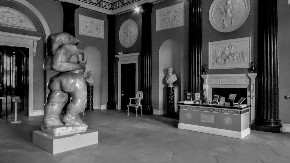
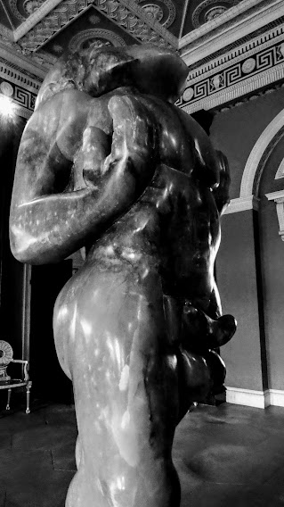
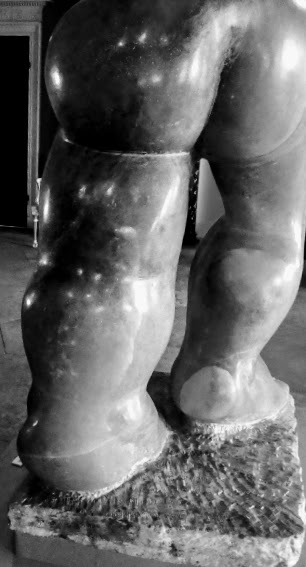
If you’re reading this, the chances are that you’ve also glanced at my previous post today, showcasing Jacob Epstein’s Adam at Harewood House. I’ve been playing with the photos, and have decided I would have done Adam more favours by showing him off, not in glorious technicolor, but in monochrome. What do you think?

An addition to Lens-Artists Photo Challenge #220 One Subject Three Ways, and a contribution to Bren’s Mid-Week Monochrome #109.
You can have too much of a good thing, so I’ll hold back my other post from Harewood for a day or two.

Beautiful monochrome images… Thank you for sharing xx
LikeLiked by 1 person
Well, you can take responsibility for this. I realised I hadn’t even considered monochrome for these images till I thought of you.
LikeLiked by 1 person
Oh that you xx
LikeLiked by 1 person
I like the monochrome version! It brings out the details and contours.
LikeLiked by 1 person
In agree. I should have thought of it earlier.
LikeLike
I prefer monochrome.
LikeLike
I wish I’d thought of it before now! It works, doesn’t it?
LikeLiked by 1 person
Definitely the monochrome which eliminates the rather distracting purple light around the other, smaller figures.
LikeLiked by 1 person
Join the club! We’re all liking monochrome best.
LikeLike
B/W can be a winner
LikeLiked by 1 person
Dunno why I didn’t think of it before.
LikeLiked by 1 person
Well, you got there.
LikeLiked by 1 person
Slow and steady …
LikeLiked by 1 person
Well, that’s allowed!
LikeLiked by 1 person
Oh yesssssss!
LikeLiked by 1 person
You are officially accepted as a member of the Monochrome Appreciation Society.
LikeLiked by 1 person
I am honoured!
LikeLiked by 1 person
😉
LikeLiked by 1 person
Looks good in B&W 🙂
LikeLiked by 1 person
Yep, that seems to be the vote.
LikeLiked by 1 person
This monochrome interpretation is fantastic!
LikeLiked by 1 person
It is better, isn’t it? I got there eventually!
LikeLiked by 1 person
He looks most imposing and impressive in monochrome.
LikeLiked by 1 person
Yes, he prefers the austere touch, I think.
LikeLike
Yes, the monochrome works better with less distractions.
LikeLiked by 1 person
Quite so. I’m a slow learner 😦
LikeLiked by 1 person
I never think of using monochrome unless prompted.
LikeLiked by 1 person
I’ll try a bit harder now, perhaps, to think about it.
LikeLiked by 1 person
Oh yes, looks like everybody’s in agreement with you that the monochrome is better. Somehow weirdly makes him look even larger in the header photo.
LikeLiked by 1 person
It’s definitely a decision I should have made earlier!
LikeLiked by 1 person
I agree, monochrome works much better – the room becomes less of a distraction and disappears into the background, letting him take centre stage!
LikeLiked by 1 person
Absolutely right. I’m a slow learner.
LikeLiked by 1 person
No, you were just experimenting, as we all do 😘
LikeLiked by 1 person
Monochrome works well here
LikeLiked by 1 person
It’s the Right Answer, isn’t it?
LikeLike