This week’s Nature Photo Challenge from Denzil is about water plants. My archive has not been especially revealing, and if you think I’m going out on this day of torrential rain to find more, you’ve got another think coming. Perhaps this is a chance to join in to with Jez’s Water Water Everywhere challenge too?
I’ll issue a challenge of my own too. I rather like the images below of spiky, statuesque reeds and grasses in black and white. But perhaps you prefer the original colour?
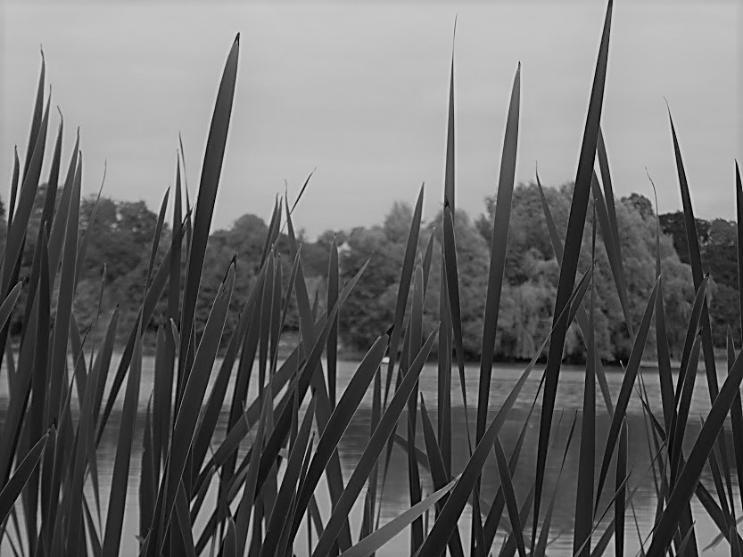
My first one is from the lake at Kiplin Hall, North Yorkshire

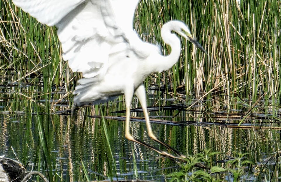
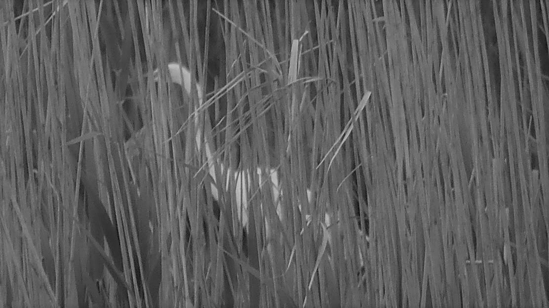
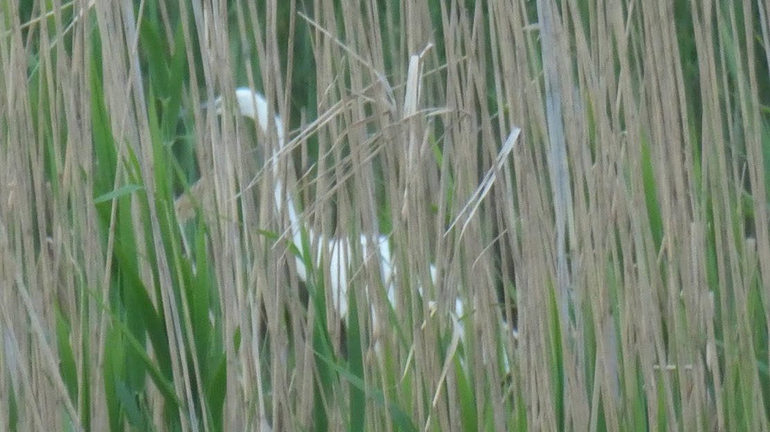
Then we’ll move to Lake Prespa in Greece, where the reeds obscure a handsome egret.
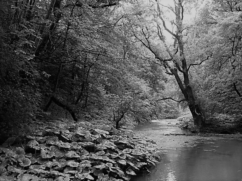
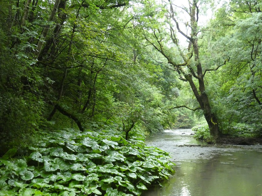
Then back to England, to the River Wye in Derbyshire.
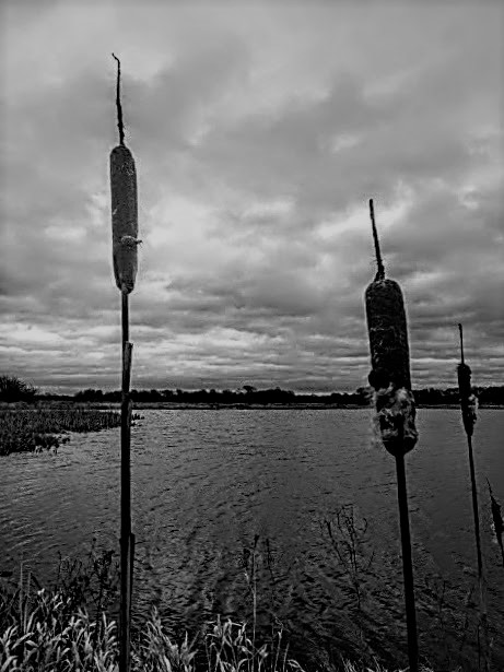
This is a local Nature Reserve at Staveley, North Yorkshire on a bitingly cold day which at least the bulrushes could endure.

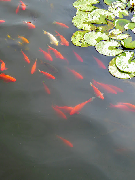
My header photo is also from Lake Prespa. I thought the egret and his reedy background demanded colour. Just as my final shot, taken in the gardens of the National Museum, Seoul. South Korea rather requires that splash of orange.

Well, well done with your trawl through the archives! Not quite as empty as you initially thought them
LikeLike
No indeed, though perhaps the variety was lacking.
LikeLiked by 1 person
Well, you posted…
LikeLiked by 1 person
I prefer the black and white for the Staveley and Kiplin Hall shots but colour for the others. Perhaps it’s the shapes against the sky that have swung it for me. Hope it clears enough for a walk for you.
LikeLiked by 1 person
Actually, I tend to agree with you. It’s the Kiplin Hall one that I initially converted to b/w. The rest were an experiment. Today – only – will be dry. The rest of the week is … rain.
LikeLiked by 1 person
Love that last one with the fish and the water lilies. Very calming. Shame about the weather, hope it clears up a bit. Enjoy the one promised dry day, at least!
LikeLiked by 1 person
Yes, I’m fond of that last one too. South Korea, like Japan does Calming Gardens very well. After today, I have a week of entertaining a Spanish toddler, my granddaughter, in the rain. First stop? The wellie-boot shop!
LikeLiked by 1 person
That’s what I call using your initiative, Margaret. The jury’s out on all but the River Wye. For me that has to be in colour. I am, as you’ve maybe noticed, a colour person, but I can see the attraction of the others.
LikeLiked by 1 person
You and I agree. I only put that one in b/w because I was doing this ‘compare and contrast’ series. It’s much more woodlandy and peaceful in green I think.
LikeLike
Yes 🤗💚
LikeLiked by 1 person
That last photo needs to be framed and put on a wall
LikeLiked by 1 person
Oh, thanks. I rather like it too – also for its memories.
LikeLiked by 1 person
I like colour too, but do enjoy playing with the sliders. The b&w versions are more timeless but the green are more uplifting and inviting.
LikeLiked by 1 person
I agree. The sliders slightly annoy me though, because I at least never seem to manage to get the whole of one image, and then the whole of its pair. It’s probably just me.
LikeLiked by 2 people
It takes me a few goes to see the whole picture. There may be a technique we’re missing.
LikeLike
Yes, but you shouldn’t need a degree in Slider Management.
LikeLiked by 1 person
And on the phone app you don’t even see the slider, just one photo above the other. Which is fine.
LikeLiked by 1 person
Quite. Reading on the phone is a different experience.
LikeLiked by 1 person
My personal favourite is the pond with the koi. I should have thought about the Japanese garden for water plants.
LikeLiked by 1 person
Ah, we always think of something when we look at other posts.
LikeLiked by 1 person
True! I also have some fabulous bullrushes taken at Wisley.
LikeLiked by 1 person
Another time …
LikeLiked by 1 person
Goldfish are just not the same in black and white!
LikeLiked by 1 person
The clue is in the name …
LikeLiked by 1 person
Oh really!
LikeLike
Your dig about found some beauties Margaret 🙂
LikeLiked by 1 person
I hope so Brian.
LikeLiked by 1 person
I like the way you’ve focused on some plants that haven’t featured much in other responses, even if it was out of necessity! I’m going out on a limb to disagree with many of the comments I’ve seen above! I prefer the Kiplin Hall shot in colour because I’m drawn to the profusion of green (what I call almost a monochrome colour shot, since monochrome really just means of one colour, not necessarily black and white!) Most of the others I think work similarly well in either but the one I personally prefer in B&W is the one most people seem to like in colour, the River Wye! Yes, the colour version is lovely but the B&W has an interesting depth and moodiness which makes it more unusual imho 🙂
LikeLiked by 1 person
Ah Sarah, nice to see another point of view. That Kiplin Hall one was translated into B/W some time ago and I really liked it, so I gave the other shots a go. And no, for me the River Wye has to stay green. Each to her own eh? But thanks your thoughtful comment.
LikeLiked by 1 person
Just shows how subjective photography is!
LikeLiked by 1 person
Kiplin Hall and Stavely make more of a statement in b&w, maybe because it makes the stark shapes stand out more?
LikeLiked by 1 person
I agree! But it’s all so subjective, isn’t it?
LikeLike
Exactly! That’s why I put a question mark – I’m not even sure why I think it myself.
LikeLiked by 1 person
The comparison of these images are very interesting. I like the color version of the Nature Reserve at Staveley. The last one is beautifully captured.
LikeLiked by 1 person
Thanks It’s interesting how we all feel differently about which ones work best in colour, and which in b/w
LikeLike
On the whole I prefer the colour ones here, though a couple of them are nicely atmospheric in black and white. The fish certainly wouldn’t have worked as well in b&w!
LikeLiked by 1 person
No, black goldfish wouldn’t work! Yes, I think there are a mix of colour and b/w which work better here.
LikeLiked by 1 person
I’m with you on the first and last shots – colour definitely needed. The inbetweeners are more difficult to decide upon. To achieve that sense of cold, in the Stavely shot for example, the b & w definitely works better. But the River Wye I prefer in colour. As usual, all are compelling.
LikeLiked by 1 person
Thanks Sandra. You seem to fit in with the popular vote. I do too. I don’t know what that says about us!
LikeLiked by 1 person
It’s dry, humid, and warm here. And there’s smoke from the Canadian wildfires. I would prefer rain. I love your photos and I like the device where you can slide over the black and white to real the same photo. Very smart!
LikeLiked by 1 person
I’m hardly ever in favour of converting nature shots in b&w even when I can recognise that it adds something to the design. But I do like the rushes in monotone, it just … suits them, I guess, is what I want to say.
LikeLiked by 1 person
Well, there you go! Success! I’ve made a convert with a single photo 😉
LikeLiked by 1 person
😄
LikeLike
It’s fun isn’t it? And my daughter, over from Spain with our granddaughter would definitely agree about the rain. Is it extremely hot where you are?
LikeLike
Thanks for playing along, Margaret 😊 In general, I prefer the black & white; there’s more definition & you see the textures better. For the bull rushes, I prefer the original, the blue tinge to the shot emphasises the cold 😃
LikeLike
That’s a good point Jez, I hadn’t thought of that. There have been some quite different answers offered.
LikeLiked by 1 person
Marvelous!
LikeLiked by 1 person
Thanks!
LikeLiked by 1 person
Quite an archive you have Margaret. B/W always adds a certain mood, although the one of the bulrushes already looks pretty grey. Thanks for your submission!
LikeLiked by 1 person
You’d have been grey on that particular day, Denzil!
LikeLiked by 1 person